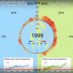
This graphic, by Boggis Makes Videos and put on YouTube just a few days ago, breaks all the rules of how to make effective, understandable graphs for the general public. However, if you follow all those rules, it is difficult or impossible to get certain message across. Therefore, this graphic is necessary if a bit difficult. I would like you to watch the graphic several times with a prompt before each watching so that you fully appreciate it. This will only take you six or seven minutes, I'm sure you weren't doing anything else important.
Pass 1: How to read the graph
This graph's basic…
Advertisment