graphics
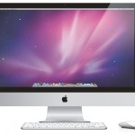
What are the best applications, free or cheap, to install on your iMac for basic tasks and productivity?
This post is to guide you in the careful and considered upgrade to your newly acquired iMac or other Mac OSX machine, especially for non-Mac experts. For each of the categories of work you may want to do with your computer, I suggest a number of applications beginning, where possible, with the applications already on your computer, then moving on to free alternatives, then inexpensive paid alternatives. In many cases there is a high end expensive alternative that is probably very wonderful…
A lot of people have been blogging and Twittering about this subway map of science, which puts various branches of science in the place of the lines on the London Underground map, showing connections between them. It's a huge graphic, but a kind of cool image.
I do, however, have a problem with it, which is illustrated by the key to the lines shown at right. The category of physics is presented as "Theoretical Physics and Quantum Mechanics." I have no problem with the quantum part, as quantum mechanics is one of the greatest intellectual achievements in human history. I do have a problem…
tags: Grab More Science, LabGrab, science news, technology, graphic, image of the day
Image: LabGrab, 13 January 2010.
An American start-up company in Portland, Oregon, announced the release of their new technology that creates a colorful chart to visualize the volume of science and medical stories published by discipline (above). The boxes are defined by discipline and their sizes are determined by the total number of article headlines published by universities, journals, science news aggregators, and science blogs within the given time period (as defined by the user).
"We read a…
