data visualization
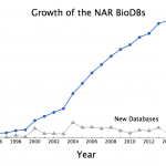
Something interesting happened in 2014. The total number of databases that Nucleic Acids Research (NAR) tracks dropped by three databases!
What happened? Did people quit making databases? No. This year, the "dead" databases (links no longer valid) outnumber the new ones. To celebrate Digital World Biology's release of Molecule World I'll discuss some of the new structure databases below. But first, the numbers.
As summarized in the database issue's introduction, Galperin, Rigden, and Fernández-Suárez tell us this year's issue has 172 papers. 56 of those…
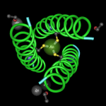
Pull a spaghetti noodle out of a box of pasta and take a look. It's long and stiff. Try to bend it and it breaks. But fresh pasta is pliable. It can fold just like cooked noodles.
When students first look at an amino acid sequence, a long string of confusing letters, they often think those letters are part of a chain like an uncooked spaghetti noodle. Stiff and unbending, with one end far from the other.
Molecular modeling apps let us demonstrate that proteins are a bit more like fresh pasta.
If we apply rainbow colors (Red Orange Yellow Blue…
Posted to the homepage on January 20, 2012
On Aetiology, Tara C. Smith shares the results of her latest study into methicillin-resistant Staphylococcus aureus. She and her team "looked at not only conventional meats, but also 'alternative' meat products" labeled "raised without antibiotics" or "raised without antibiotic growth promotants." Smith writes, "In our previous paper, we found MRSA on 1.2% of 165 meat samples. In the current study, we found a higher prevalence—6.6% of 395 samples were contaminated with MRSA." She believes the current, higher number more accurately reflects the…
It's been interesting to watch as microbiology's own cold fusion debate has been raging. It began with an extraordinary claim about bacteria using arsenate as a replacement when phosphate concentrations are low (1).
It progressed when at least two scientist / bloggers ( here, and here) (not bloggers! the horrror! how uncivil!) gave public "journal club" presentations on blogs (envision dripping slime).
It continued with the science journalists lamenting about having swallowed the hype.
And it seemingly ended with another scientist / blogger's post that seemed to equate discussions…
Worldmapper is a web site with 366 maps of the world. These maps however, are not the kinds of maps you've seen in school, with every country shown by size. These maps are cartograms. It's a bit like seeing a cartoon version of a Thomas Friedman book. These maps present a whole new way of visualizing information about the world.
In a cartogram, the size of each country or geographic region is drawn in proportion to some kind of variable. The variable could be population size, number of people who practice a certain religion, incidence of infant mortality, voting patterns, energy use,…