False Hope Graph
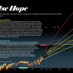
I needed a copy of the "False Hope Graph" that Michael Mann painstakingly created for his Scientific American piece "Earth Will Cross the Climate Danger Threshold by 2036" for a presentation I'm doing, but it had to be simpler, leave some stuff off, and be readable across the room on a screen. The original graphic looks like this:
It is a major contribution showing the relationship between climate sensitivity and climate change in the future depending on various important factors. The graphic I made from it is here (click on it to get the big giant version):
You'll notice I left only one…