green house gas
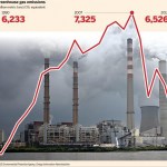
Above is a graphic someone tossed at me on twitter the other day. It makes it look like CO2 emissions went way up then went way down so everything is fine. It is, of course, a lie, of sorts.
IT is actually kind of hard to find a graph just for US CO2 that goes back in historic time, but this graphic for the global energy industry clearly shows that the big picture is an upward trend:
The dip we see in recent years is simply an effect of the economy going bad, and things people do that emit CO2 being done somewhat less. Kevin Schultz wrote this up on his blog:
After a five-year decrease in…