
Every northern summer Arctic Sea ice melts away and reforms for winter, but how much melts away seems to be increasing on average, at a rate that surprises climate scientists.
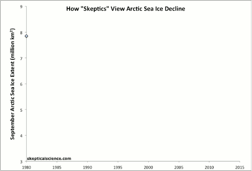
But there are some who see variation from year to year, and there is variation, in a rather unrealistic way. Here is a graph comparing how climate science denialists view arctic sea ice over time, compare to how "climate realists" (i.e., smart people who can read graphs and such) see it:
Go HERE to see the source and learn more about what is behind this graph.