map
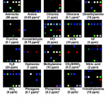
Researchers at the University of Illinois, Urbana-Champaign have developed a way to compare aromas visually using specially developed inks.
Kenneth Suslick and his colleagues used tiny squares of polymer film that hold 36 drops of carefully designed dyes. These pigments change colour when exposed to various chemicals. The result is a cheap system for detecting very low concentrations of gaseous compounds. The cards can be used like a physicist's radiation dose badge to alert lab workers when they have been exposed to toxic gases.
As shown above, the cards can be used to give each…
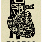
As a fan of maps, typography, and anatomy, I think this is a pretty sweet mashup.
From orkposters.com via Street Anatomy.
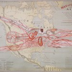
Another fabulously weird map, from the great blog Strange Maps. This one is entitled "The Man of Commerce" and dates to 1889.
According to the American Geographical Society Library,
The highly detailed 31" x 50" map/chart conflates human anatomy with the American transportation system, in an apparent attempt to promote Superior as a transportation hub.Its metaphor makes West Superior "the center of cardiac or heart circulation"; the railways become major arteries; and New York is "the umbilicus through which this man of commerce was developed."The explanatory notes conclude: "It is an…
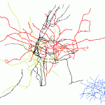
We all know some cities "feel" smaller than others. But this set of subway maps presented at the same scale makes the differences obvious.
Just for fun, I made this image layering four of maps from major world cities in red, black, gold, and blue. Recognize the cities? Answer after the fold. . .
Sizewise, the winner here is London, shown in red. New York, in black, is a close second. The much less complex gold-green pattern is Washington, DC - note that it only approaches the size of New York and London because of the long spindly commuter line reaching north into Maryland. And that dense…