climate change graphics
Don't hold your breath:
source
After I made this graph I found out that there is a version of it HERE with more info on the background.
This is a hockey stick:
This is the Grim Reaper's Scythe:
This is global temperature over the last 10,000 years projected into the immediate future using good scientific estimates:
You decide. Should the Hockey Stick be replaced with the Grim Reaper's Scythe?
More information on the climate change graphic HERE.
See more climate change graphics HERE.
If you are not sure what any of this is about, you can read about the Hockey Stick thing here.
For the last 25 years or so there has been a decrease in the amount of ice that remains on the surface of the Arctic Ocean every summer. This is a trend that can be attributed to global warming, which in turn, can be attributed to the steady release of previously fossilized Carbon to the atmosphere by the burning of coal, oil, and natural gas. But over the last few years, this decrease in ice has been much more dramatic. The trend has steepened. The formation and melting of ice has to do with air and water temperatures. This in turn can be affected by how much ice there is, because ice…
This is being discussed here, thought I'd show you this:
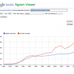
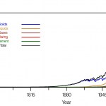
Use of the terms "Global Warming" vs. "Climate Change" in books

This graphic is from GRID-Arendal, a Norwegian Foundation collaborating with the UN Environment Programme. It shows CO2 concentrations in the ocean going up over a period of 20 eyars, and the corresponding drop in pH over the same time period.
Ocean acidification is a serious effect of climate change.
As carbon concentrations in the atmosphere increase, so do concentrations in the ocean, with resultant acidification as a natural chemical process.
There are more climate change related graphics HERE.
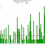
This graph shows the extremes in one-day precipitation in a given month relative to the amount of precip in that month for the Northeastern US. So, if the green bar is at 30%, that means that that 30% of month's precip fell in one event. The way this is computed is a little complicated because it is hard to define an "event" in time and space in relation to the time and space coordinates (as it were) we normally use. Check the source of the graph for a more detailed explanation. The point of this graph is that the opposite is true from what many expect: It isn't the case that the snow was…
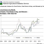
Here's a graph from the USDA:
This comes from a post by Peter Sinclair: USDA: Warming Will Devastate Agriculture.
Also from that post, this interview with Phil Robertson of Michigan State University related to the question of C02 as "plant food."
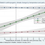
It seems that people "believe" in climate change (really, global warming in particular) when it it hot out more than at other times. And by "people" I mean the population in general. It turns out that Democrats don't change their position on climate change as the temperature outside changes (they already know it is real) and Republicans do a little (because it is true and a small number of them will put reality before politics). Meanwhile, those darn Independent voters who have somehow taken over our democracy for some very poor reasons (IMHO) wildly change their beliefs literally on the…
Here are two graphs that show the amount of carbon released into the atmosphere, mainly as CO2 and mainly form the burning of fossil fuels, per year, from various sources for a long span of time. Both graphs are based on the same data set. the first graph was created by the Carbon Dioxide Information Analysis Center and shows the breakdown between different sources of carbon. The second graph, which I made, simply shows the total, and over a shorter time span to make it easier to use for other purposes.
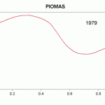
Here's a graph showing the extent of arctic sea ice as measured directly and indirectly for the last several hundred years:
Solid red line is the reconstructed 40 year smoothed, late-summer Arctic sea ice extent from Kinnard et al. (2011). Shaded area shows 95% confidence interval. Blue dashed line shows modern observations.
This graphic is from Skeptical Science, where you can also download a higher res version and learn more about the background for these data. Also, on that page is a link to a large number of useful graphics related to climate change.
.
Skeptical Science is a great source for information about climate change. One of the coolest things they've got over there is a moving GIF demonstrating how the folks in the climate science denialism industry try to convince people that global warming isn't real. This involves cherry picking data to show small segments of time with either flat lines (no warming) or decreasing lines (cooling), and ignoring that the longer term pattern is one of a distinct increase.
Here's the graphic:
How to make it look like global warming is a hoax!
For more information about this graphic, and other…
Anthropogenic global warming is a long term phenomenon that is caused by the release of Carbon, in the form of Carbon Dioxide, from fossil deposits, though burning of fuels such as oil, natural gas, and coal. There are other human causes as well, but some of those relate to the use of fossil fuels (such as the leakage of methane gas from oil extraction operations, or from delivery pipelines).
The evidence for warming comes from a variety of sources, but mainly from land based thermometer stations from about the mid 19th century and later, higher tech measurements such as satellites.
The…