climate change graphics
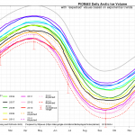
The latest, updated, Arctic Death Spiral graphic from Andy Lee Robinson ...
I made this huge giant meme for you. Click on it to see it in your browser all by itself, might be easier to read:

The title of this post is actually the title of a post I want to point you to. It is HERE.
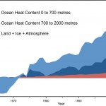
The post is the outcome of a bit of a competition a couple of us have going to make an effective meme (in this case, the girl with the thermometer in her hair) to underscore the fact that "global warming" is different than "surface warming" (or at least, that's how I'd put it). The former includes the oceans, sea surface, air, ice. The latter includes all that but not the deeper oceans. Since the VAST majority of the excess heat building up because of AGW is in the deeper oceans (below the SST),…
The famous Polar Vortex has come and gone in North America. Then, it came back. What a jerk.
As I write this the outside temperature is 13 degrees below zero Fahrenheit, and tomorrow morning’s Bus Stop Temperature promises to be about –25F windchill here in central Minnesota. Meanwhile my Twitter stream is polluted with climate science denialist tweets pointing out that it is too cold outside to believe in global warming, even though the entire land area of the United States, where this cold is being experienced as a cultural and physical phenomenon, is about one and half percent of the…
First, there is no hiatus. Climate science skeptics claim that warming stopped in 1998. It didn't. Stefan Rahmstorf has a nice post placing 2013 in context with the most recent data, HERE. Just click the "translate" button to read it in your favorite language.
UPDATE: Stefan's post is now HERE on Real Climate, in English.
Stefan has a bunch of great graphics that you will enjoy. Following his lead I've decided to make a graphic or two myself.
First, the data. NASA has this data to which people often refer when discussing global warming. I took that database and fixed it up a bit. I…
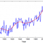
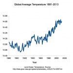
Surface temperatures are only one way to measure global warming, but it is a sort of standard and it is meaningful because surface temperatures have a lot to so with weather and such. Data for NASA's GLOBAL Land-Ocean Temperature Index in 0.01 degrees Celsius using a base period of 1951-1980 can be found HERE. Climate Communicator ThingsBreak put a graph on the internet based on those data for November. Here's a copy of it:
Earth’s surface temperature in °C for each November since 1880 (compared to base period, 1951-1980). Stefan Rahmstorf, creator of the graphic, used the SSAtrend…
We call it "weather whiplash." This is not just meteorologists being funny. It is a phenomenon that perhaps has always been with us to some degree, but that has recently become much more common, apparently. If you were under the impression that there is a lot of strange weather going on out there, you may be right, and weather whiplash may be the phenomenon you've noticed. Importantly, there is good reason to believe that weather whiplash is the result of anthropogenic global warming. In other words, it's your fault, so please do pay attention.
Weather patterns tend to move…

Recently, formerly respected writer Matt Ridley has been making a fool of himself with absurd and scientifically unsupported commentary on climate change. Recently he wrote something for the Wall Street Journal, "Dialing Back the Alarm on Climate Change," that serves as an example of this.
Professor John Abraham has also provided an item for the Wall Street Journal that addresses Ridley's goof. As Abraham puts it, "Matt Ridley states that a forthcoming major climate change report will lower the expected temperature rise we will experience in the future ("A Reprieve From Climate Doom,"…
From Climate Bites we have this nice meme thingie:
It has been said that global warming has stopped over the last several years. Some say it has not been happening for 17 years, some say for ten years, some say for 12 years. Let's test these hypotheses
Hypothesis: June, the most recent month with full data, was an average year, not a warm year.
Now that July is nearly over, we can look back at the data for June and see how warm or cool June was.
According to data from NOAA and NASA, summarized here,
June was one of the hottest such months on record globally...The month extended the unbroken string of warmer-than-average months to 340,…
Climate Scientist John Abraham and I just finished a session of FtBConscience on Climate Change and during that session we promised to provide some useful links. We also used some graphics during the session. Below are the links and the graphics!
First, here is the video of the session:
Climate Change Science Twitter List
I created a twitter list of people (or organizations) that tweet about current climate change science. If you check this list at any given moment you’ll know the latest climate science news. If you have a suggestion as to who should be added to this list, send me a tweet!…
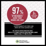
No. Here's a handy graphic for you to enjoy and share, courtesy of Climate Nexus.
Also, you might want to ask the question: What has global warming done since 1998?
That question is addressed HERE, where this handy graphic is available showing the importance of ocean warming:
So, has global warming stopped? No, I'm afraid not.
_____
Other posts of interest:
How to get rid of spiders in your house
Why is your poop green?
How many cells are there in the human body?
Is there really a plot hole in Harry Potter Goblet of Fire?
How long is a human generation?
Is blog ever really blue?
How to…
Earlier in the northern summer, it looked like the rapid melt of Arctic Sea ice we've been seeing over the last several years was happening again, but rather than being a record year, it was merely tracking along the lower side of the distribution of the long term average. Last year, in contrast, the amount of sea ice hit an all time low early in the year and then broke previous records into tiny icy pieces.
One of the reasons last year's ice melt was so dramatic is that an early storm churned up the ice and got melting going a bit early.
This year, there was no early churning up event,…
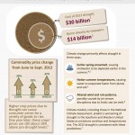
Here we have a nice new infographic for you to gaze at, share around on your facebook accounts, and so on. (It is below.) Here in Minnesota, we've got a problem getting that last one million acres of corn planted (about 1/8th of the normal amount), not because of drought, but because of excessive rain. However, all that extra rain is not expected to alleviate the effects of our drought long term, so we get to have both. If the price or availability of major food types ("commodities") goes south (up and down, respectively) here and there, adjustments can be made. But if climate change…
... or Climate Noobs Bork Climate-science?
... or Can't News Be Correct?
(add your own below)
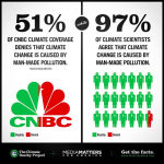
The thing is, CNBC, which is supposed to be a news station, is fueling public misunderstanding of climate science. This is bad journalism, and virtually criminal given the importance of climate change and the need for good science based policy related to climate change. We are long past the point where we can tolerate false balance, astro-turfing, and rating mongering. We need to have a good public understanding of climate science, we need it now, and we need "news" organizations like CNBC to stop…
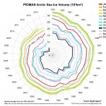
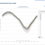
Since 2001 the amount of Arctic Sea ice that has melted during the summer has generally increased. There may have been a long term trend in melting of ice in the northern hemisphere generally, including mountain glaciers, the Greenland glaciers, and seasonally, Arctic Sea Ice. But the seasonal melting of Arctic Sea ice seems to represent a metastable shift unprecedented in available data. There is probably a tipping point followed by positive feedback. From 2001 onwards, the amount of sea ice melted each summer has gone up, and this has resulted in two related effects: 1) The total amount…
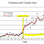
There are good reasons to believe that global warming leads to more storminess, but the exact nature of that transition is unclear and hard to measure. Part of the reason for this difficulty is that a given type of storm may become more likely under certain conditions caused by climate change, while a different kind of storm may become less likely, with the "storminess" overall increasing but doing so indifferent ways across time. Also, the most severe, and thus possibly the most important, weather events are infrequent so it is difficult to see changes over time with any statistical…
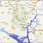
You've all heard about the horrible tragedy in Bangladesh, still unfolding. Not to distract from that event, or diminish its importance, I thought it would be interesting to have a look at that low lying country in relation to long term sea level rise caused by climate change. I am making no claim here about the maximum rate of sea level rise or about the timing of sea level rise. But the truth is, there have been times in the past when there was virtually no year round ice (glaciers) anywhere on this planet, and sea levels were much higher than they are now. During a time period not too…
Andy Lee Robinson's latest visualo-info-graphico-depiction of the loss of Arctic Sea Ice:
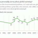
There is a new Gallup poll that together with earlier data from Gallup provides some interesting information about attitudes in the US about global warming.
Earlier polls have shown increase and decrease in concern about global warming, and changes in what people think of news about climate change and the severity of the problem. Recently, there has been a shift towards greater concern which follows a low point, which, in turn, follows a period of global concern.
One question involves reading off a list of specific concerns related to global warming and asking participants to rank their…