
First, there is no hiatus. Climate science skeptics claim that warming stopped in 1998. It didn't. Stefan Rahmstorf has a nice post placing 2013 in context with the most recent data, HERE. Just click the "translate" button to read it in your favorite language.
UPDATE: Stefan's post is now HERE on Real Climate, in English.
Stefan has a bunch of great graphics that you will enjoy. Following his lead I've decided to make a graphic or two myself.
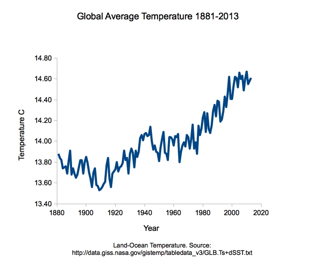
First, the data. NASA has this data to which people often refer when discussing global warming. I took that database and fixed it up a bit. I deleted the first year because there's some missing data and who cares about only one year anyway. Then, I converted all the values to degrees C rather than hundreds of degrees off a baseline. I also calculated a rank for each year in reference to the entire database. You can download the data as a comma delimited file here. Let me know if that link doesn't work for you, I'll be happy to send you the file. Please cite the original (linked to above) if you use this.
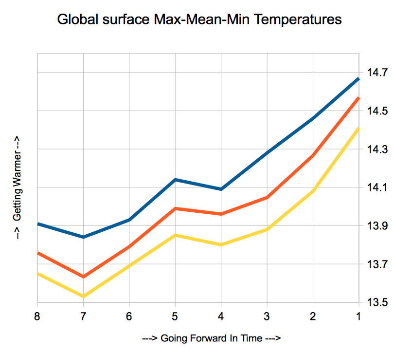
Using these data I made this handy graphic showing "surface temperatures" (air and sea surface) over time from 1881 to the present.
When people talk about the hiatus in climate change, or the pause in climate change, what this means is that the slope of the temperature curve for a particular period of time is at or near zero, or negative. What actually happens is that the slope of the curve for a given interval, say 10 years, goes up and down over time. If the temperature was varying around a mean, and not going up over time, the sum of those slopes would be zero, but if there is an average increase in temperature the sum of all the different slopes (of a given interval) one can calculate will be positive.
This is actually a slightly strange way of looking at the data, but I think it is constructive, especially given that the so-called-pause is a dead horse and we are hear to beat it. Look at the chart above. Imagine taking any given ten year period and calculating a slope for that period. Then another and another and another, until you've measured out a slope for every ten year period ... not just every ten years, but every possible interval of ten consecutive years. This would be a "moving slope" and a graph of it would look like this:
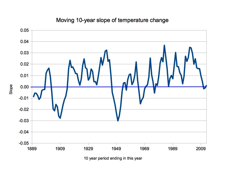
What this shows is that for the vast majority of ten year intervals since 1889 (so the first interval is 1880-1889) the slope of the temperature curve is positive, going up, increasing. It also shows what looks like a remarkably periodic increase and decrease in this slope, with only a few dips below zero. That's presumably due to oscillations such as ENSO or other factors. Also, most of those dips are from fairly far back in time, and this happens rarely in recent years. We are currently in a period of positive change (upward temperature swings) but currently reduced. But if you look at this graph you can see that there are OFTEN periods of time when the upward slope is very high and other periods when it is very low but still above zero almost always. I hope this helps put the "hiatus" into perspective.
I also made this graph of each year's rank for the entire period represented by the data set.

Again, this is a slightly unusual way of depicting the data, but it may be helpful. All of the highest ranked years ... top ten or so ... are from very recent time. The graph has grid lines at every 10 ranks. This lets you quickly identify the period of time over which the top 10, or 20, or 30, or whatever, warmest year according to this data set occurred. There are no top ten years prior to about 1998. All of the top 30 warmest years post date the early 1970s. And so on.
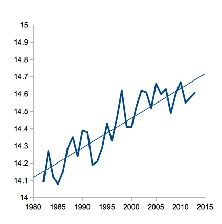
OK, so let's look at the hiatus again. The hiatus is supposed to be a period of no global warming since 1998. Here's a closeup of the original chart (above) for that period of time:

What we see here, with the trend line included to make it easier to read, is an increase in global temperature, on average, during this so called hiatus period. But, by picking 1998 as a starting point, climate science denialists have managed to flatten the curve out quite a bit. That's called cherry picking.
Now let's arbitrarily double the period of interest, to include the entire so-called hiatus and the same amount of time back before the so-called hiatus. What does the graph look like then? Here, I've tried to keep all the scales the same so you can see the shorter "hiatus" period as part of this larger graph. You can also see that 1998 was an exceptionally warm year, which is why you'd want to pick it as the beginning of your fake hiatus period if you were a damn liar. Have a look.
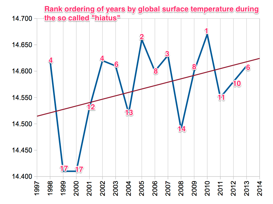
Let's look at those so called hiatus years in yet another way. Here, we have the graph of the temperature by years (with the upward sloping trend line indicating continued warming even though it is supposed to be a "pause") and at each node I've written in the rank order of the year for the instrumental record. Note that tied years share a number. Basically, this period of "hiatus" is a very very warm period indeed, with temperatures trending upward during the entire period, looking only at the earth's surface. (Elsewhere we've discussed how there is also heat going into the oceans. See links below.)
Since the climate science denialists have chosen a period of time of 16 years to describe a so-called "hiatus" which is not really a hiatus, I thought it would be fun to chunk out the data for the entire time period into 16 year intervals, starting with the most recent and going back to 1886. When viewed using these time intervals, we see overall warming with the most recent years seeing accelerated warming. Have a look:
These are all first drafts and if I get reasonable suggestions I may make new versions with corrections, additions, etc.
Global warming. It's for real.
Other posts related to the #fauxpause:
The Truth About Global Warming's Famous Slowdown
Why you sound so stupid when you say “global warming has stopped”
Well done your rank ordering indicates that every year since 2001 would have been a record year for global temperature if it had occurred in 1998. We have now made the exceptional ordinary. Since 2001-2010 is the warmest decade by simple ten year terms, and 2003-2012 even warmer where is the hiatus indeed.
1. What are the ideal conditions for our weather? This is something which to my mind; I haven't heard an answer on.
2. There have been major planetary weather changes to this planet for the entire history of this planet. .
What makes this one so different?
3. With less than 200 years of data, what makes one think their projections are correct?
4. Is this nothing more than; too little information being giving to much weight?
I am just an average person, not pretending to understand the base line information which is given.
5. Given some of the "science" which is bought and payed for by those with agendas. What makes me want to believe what you are accurate.
2. There have been major planetary weather changes to this planet for the entire history of this planet. .
What makes this one so different?
Past major planetary changes have either been the result of destructive events like meteor impacts, or they've occurred over thousands or millions of years.
This one is occurring very rapidly, and will negatively affect ecosystems around the world, as well as human agriculture. "Oh, those systems will adapt - it's what they do!" I hear you cry. Yes, they do adapt, but over thousands/millions of years. The change we're seeing is taking place over decades.
"Ideal conditions" for "our" weather are what leads to balanced productivity for a range of eco- & agricultural systems, and keeps species loss at a low enough level that systems retain enough diversity to recover from serious impacts like major storms, diseases, pollution events or over-fishing.
Given some of the propaganda that's bought and paid for by those with agendas, it's getting more and more difficult for the average person to understand how and why some types of industrial development need to be regulated BEFORE they ruin existing ecosystems.
The planet was once a fiery ball of molten rock!
Dennis, wrt 1: -
Our agriculture is based on the premise of relatively constant weather, and we can't just take the soil up and carry it north with us. That's a serious problem.
Our cities are built where things like rivers exist to provide water and transport. If those rivers vanish there will be problems.
A fair chunk of the world's population lives at or around sea level, with much of our infrastructure. Best case is that we spend a fortune relocating it.
Bottom line is that the cost of all these adaptations - even if achieved without major disruption and/or deaths - will greatly exceed the cost of accelerating a transition away from fossil fuels now, given that such a transition is inevitable.
And there are actually huge potential benefits to committing to rebuild our infrastructure.
There is a huge amount of value, and many jobs, to be gained from retrofitting our building infrastructure to save energy and reduce CO2 emissions. The Rocky Mountain Institute has been talking about this stuff for years.
Exactly. And the mechanism for paying for it is built in. There is already a monthly flow of cash. Between bonding issues and grants measures that reduce carbon and increase efficience can be implemented with only the inconvenience of the actual installation and construction being the negative outcome for consumers, and for many, significant longer term savings. If this was incentivized with some tax breaks, regulations adjusted to make it more possible to do it, and organized broadly it woudl work.
I'll have to look at the rocky mountain institute.
I guess you are using graph fitting programs like Origin etc., so why don't put any numbers of uncertainty in your graphs? I mean if you try to fit a linear trend, those programs always calculate the SD, SDE besides the mean, and I would love to see that too on every graph, generally.
I know a blog is not a science paper, but this is just a bit of extra information which can be displayed easily, and it's even more important when graphs show huge fluctuations where one can hardly see significiance of the trend. No offense, I like your blog :)
Max, my objective here is simple: To provide the raw data as a simply downloadable file, and to provide the simplest depiction of the data.
Those are raw data, and the trend we see in the global temperatures is clearly statistically significant ... after you do enough statistics these things are obvious .... even if the intra-annual variation is fairly high.
In any event, the data have been heavily analyzed and there are all sorts of graphs (also using different data sets which show the same thing) that include confidence intervals, etc. What I'm trying to do here is provide the simple version of the data for use in depicting the trend, and a way for people to make their own versions of the graphs. Well, maybe just me but now I know where I put it!
But you are right that data need to be properly analyzed. Here's an example:
http://www.skepticalscience.com/Why-The-Hottest-Decade-Was-Not-Hotter-…
Also, this is just using an OpenSource spreadsheet program to make the graphs
Dennis:
1. 'Ideal' weather for humans is basically the climate that agriculture and civilizations have adapted to over the past few thousand years.
2. It is taking place rapidly, much more rapidly than humanity and the rest of life can adapt to without major losses.
3. Physics. The inevitability of global warming (and associated climate changes) has been obvious from the physics and changing atmospheric chemistry for about 50 years.
4. No. There is overwhelming evidence that is being all but ignored by influential people in politics and business.
5. What agendas? Do you mean those of the people who depend on high fossil fuel consumption for their livelihood? Check out the science, concentrating on basic radiation physics and atmospheric chemistry. Perhaps start by searching for 'global radiation balance'.