design
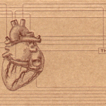
Blue Barnhouse Letterpress is simply awesome. I was idly coveting these classy anatomical heart thank-you cards when I discovered they actually have a special card FOR COLONOSCOPIES:
No, not even letterpress can make these brutal (and hopefully fictitious) colonoscopy implements "classy." But that's not stopping me from blogging it.
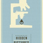
Lovely minimalist poster design from Jordan Michael Gray's flickrstream.
via NOTCOT.
Recently, Rhizome.org invited me to contribute a long-form article to their Rhizome Writer's Initiative, a new program designed to give emerging and established writers the opportunity to pontificate on the world of new media arts. I was glad to do it, especially when I realized that the exhibition I was to review is called "Beam Me Up" and that the themes it dissects coincide neatly with my recent re-appreciation of Star Trek. I include my finished article here on Universe because I think some of the ideas discussed in it dovetail well with the recent topics here--systems, complexity,…
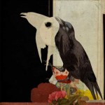
Artist Emmanuel Polanco does amazing collage work reminiscent of Eduardo Recife. I especially like this piece, but he has several more with more overt vintage-science content. See a gallery at Fubiz.
Father Heart, 2006
Black Nickel on Rolled Steel; Glass Tank - 80cc with pedal
Josh Hadar
It's always puzzled me that bicycles don't take better advantage of the gleaming potential of curvacious, polished metal. Why are most bike frames so boring and triangular? Fortunately Josh Hadar has come to the rescue, with his beautiful curved steel custom bicycles. They're all lovely, but when he adds blown glass "hearts" to their steel ribs, his bikes seem positively. . . alien. Isn't it interesting that adding elements of human anatomy makes the bikes seem more unnatural? More bikes (and the…
One of Buckminster Fuller's most interesting conceits was his dislike of specialization, which he likened to a kind of intellectual prison, restraining "bright" people from truly understanding the complex, and general, systems of which they were a part. After all, he argued, what causes extinction in the animal kingdom? Overspecialization. Of course, it's logical, and it's s problem we see over and over again in human history, from the Industrial Revolution displacing specialized factory workers to the often daunting gap of comprehension between the social and "hard" sciences. As soon as we…
The "gastronomical cocktail" called "sex on a drip" is just one reason to hop a plane to Singapore and visit The Clinic, a theme restaurant that's probably not for the squeamish.
Their website boasts, "Clinic's unique alfresco is easily identified by its hospital whites, colourful pills, syringes, drips, test-tubes, and paraphernalia in all manner of the clinical, all in tribute to the tongue in cheek pop art of Damien Hirst." I don't know about Hirst - rotting, half-preserved sharks don't make me hungry - but their website is definitely fun in a trippy, pharma-chic way, complete with…
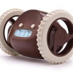
Clocky sounds like R2D2 and looks kind of like an ATV's single-axled, pastel cub. In other words, it's really, really cute. Which is why when Clocky wakes you with its piercing warbles, crashes to your floor and rolls under your bed, you won't want to smash its little display with your fist. At least, we hope not! Click through for more details.
Clocky is a clock for people who have trouble getting out of bed. When the snooze bar is pressed, Clocky rolls off the table and finds a hiding spot, a new one every day. Clocky began as a class project. After graduating, Gauri Nanda turned Clocky…
I'm here in DC at the Newseum for the State of Innovation Summit, a collaboration between SEED and the Council on Competitiveness. The crowd is pretty awesome - right now Adam Bly, SEED's CEO, is sitting a few rows from me with E.O. Wilson. Earlier, Wayne Clough, Secretary of the Smithsonian Institution, talked about a conversation he'd had recently with Steven Chu about using the Smithsonian's resources to enhance public understanding of climate change. As he spoke, the intense sunshine of a summer day in DC played across the Smithsonian castle turrets directly behind him (the seventh floor…
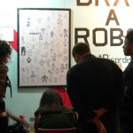
Artomatic is one of my favorite things about DC: a cooperative unjuried art gallery in a vacant high-rise, staffed by artists, with live performances and mini-bars on every other floor. It's free (except for the bars). What's not to like? The icing on the top (floor) this year is Draw A Robot - a collective crowdsourced fundraising experiment by the team at RobotDisorder.com.
Draw A Robot is a deliciously haphazard mashup of new tech and low tech. Starting at the low tech end of the process, you sit down with the pens and paper provided at the Draw A Robot booth, and you - wait for it - draw…
A beautiful anatomical ad campaign for the Zurich orchestra, via fubiz via Notcot.
Of particular interest I think is this comment on the thread at fubiz, from kmaz: "Music, and overall classical music, plays on emotion, not on the nervous system. instead of putting the music emotion above all, it takes it down heavily and awkwardly, to tie it with simple physic reactions." Really? "Plays on emotion, not on the nervous system"? Pardon me, but to a neurobiologist, that dichotomy is nonsensical. Our emotions and our nervous systems are inextricably entwined. Further, the complex physics and…
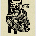
As a fan of maps, typography, and anatomy, I think this is a pretty sweet mashup.
From orkposters.com via Street Anatomy.
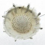
This is. . .
A. The surface of one of Jupiter's moons
B. Thermophilic archaebacteria in a hot spring
C. The pigmented iris of a Madagascar gecko
D. An electroformed enamel and copper pendant
E. Multicolored lichen at Enchanted Rock, Texas
Answer after the fold!
D* is correct: it is actually an enamel and copper electroformed pendant called "EyeSpy" by artist Kristina Glick Shank.
Shank's series of electroformed pendants impress me with their blend of controlled detail and organic (well, technically, mineral) textures. The electroforming gives an uncontrolled, natural feeling to the pieces…
My first thought on seeing the new Toyota Prius commercial was, "are those cells and membranes?!" No, they're people in costumes, but the resemblance of the Prius' cartoon world to a cell animation is pretty remarkable. The sun TOTALLY looks like it has transmembrane receptors on it.
My second thought was, wow, this is perhaps the first commercial I have seen to really make compelling use of high-definition TV. I kept getting closer and closer to my screen. So do yourself a favor, and click through to watch it in high-def if you have a decent connection. It's hypnotizing.
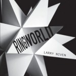
I love this line of covers for a UK publisher's re-issue of sci-fi classics: their simplicity underscores the stark, anxious, fractured psychological underpinnings of futuristic fiction.
As author Stephen Baxter told New Scientist, "Science fiction has rarely been about the prediction of a definite future, more about the anxieties and dreams of the present." That's why covers that cater to indulgences (lush technicolored paintings of muscular space barbarians defending busty astronaut ladies from tentacled aliens, etc.) are fun, yet leave me feeling too often that the author's vision has…
Over at his Discover blog, Carl Zimmer has asked readers to help choose a cover for his new non-majors evolution textbook. If you have a good eye for design, as I'm sure many BioE readers do, go over and help him pick the most appealing cover!
It's a hard choice, as so many design choices are. I'll leave my vote until after the fold so I don't prejudice you.
Okay; so I like all of them, but don't *love* any of them. My problem with the orchid, which I think is the most elegant and subtle design, is that it doesn't say "evolution" to me. It says "botany." Then it says "yawn." The minute I…
Long pin (detail)
Hand-made paper with cast silver seed inclusions and fine silver.
Sabrina Meyns
Irish artist Sabrina Meyns makes jewelry out of paper and silver. This piece may be less durable than your typical jewelry, but it's certainly more robust than the fragile poppies it mimics, and the translucency and delicacy is breathtaking. Unfortunately, her site only has a few examples of her work, but hopefully we'll see more of her in the future.
Via Daily Art Muse
The Ambassadors, 1533
Hans Holbein the Younger
In the artistic technique called anamorphosis, an object is depicted in distorted perspective, so that the viewer has to take special action, like looking from a specific angle, to see the "correct" image.
The most famous example of anamorphic painting is Hans Holbein's The Ambassadors (1533), a double portrait in which the illusion of highly detailed reality is fractured by a blurred grey streak superimposed across the painting's bottom third. If one stands at an acute angle, close to the painting, the blurred streak resolves itself into a…
Wilkins is fragile and destablised
Intellectual tourist attacks local inhabitants
All happy bacteria are alike (or is that like each other?)
Australian current affairs gets vaccination right! [That's not a pun, it's an act of God] The original video is here.
Evolution does spreadsheets in origin of genetic code
Siris and Sandwalk go head to head on the Courtier's Reply. Neither of them are dressed.
Creationists misunderstand Deep Time. I'm shocked. I mean, it's only ten years since they were taken to task for it. Perhaps if they had millions of years to think it over...
This air purifier ad from Sharp is a little creepy, in a Spongebob Squarepants way. I love how you can see their fluorescent organelles! Unfortunately I don't see anything here that resembles a virus, but with swine flu all over the news, this serves as a good reminder to wash your hands.
Ad by Takho Lau for ad agency M&C Saatchi of Hong Kong. Found via Next Nature