
The images from my new camera are huge-- 6000x4000 pixels-- so when I post them here, I need to re-scale them (in theory WordPress can do that automatically, but it's never worked right on the rare occasions that I've tried). Since I'm opening the pictures in GIMP anyway, I generally do a little cropping and color-correcting. When I'm taking photos of the kids, it's often hard to get them framed really well for the initial shot (they insist on moving and doing cute stuff...), so the cropping is sometimes very significant.
One of the rules for composing photos that even a doofus like me knows is the rule of thirds, which (loosely) suggests that it's best to put important elements along the one-third lines of the image. And since I'm doing a bunch of image-editing these days, it's striking to see how effective that really is.
By way of illustration, I snapped a bunch of photos the other day of The Pip running in the late afternoon at a local playground. If I crop one of them tightly to just him, it's... okay:
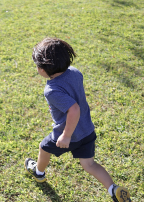 The Pip running, cropped tightly.
But a wider shot, with him off to one side in a rule-of-thirds-ish sort of way, is much nicer:
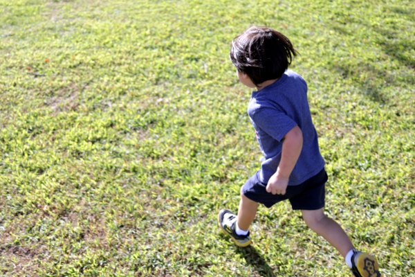 The Pip running, in a wider shot.
The wide space to the left side of that gives you a better sense of the light, and somehow that makes his determined running more apparent and effective (he runs pretty much everywhere, usually in a pose that suggests he expects to need to break through a wall on the way to wherever it is he's going).
I'm not claiming to have discovered anything revolutionary here, mind; this is all well-known stuff. But it's been interesting to see it play out as I edit all these photos. And also: look at my cute kid!
The photography rule of thumb that you've identified is that to show motion, allow space for your subject move into. The "rule of thirds" is a pretty good SWAG but of course you can violate it to good effect. The main good outcome of the rule is to avoid placing your subject dead center in the frame, which can be pretty stagnant.
The composition issue I work on at this point is to start making decisions about what happens on the edge of the frame. Of course, that's a lot easier when shooting landscapes than when shooting kinetic kids...
Try putting the pip on the other one-third vertical line and you'll find a new rule of thumb--the main subject should generally suggest a motion or connection towards the other two-thirds.
So anything with an obvious direction of motion should generally appear to have just entered the frame, rather than appearing to be just about to exit.
Corollary: anything vaguely L-shaped should generally have the two sides of the L bordering the central square.